Pages

Showing posts with label Reference. Show all posts

Thursday, December 11, 2014

Gloria J Zucaro's "The Reference As A Starting Point"

This past week I experimented with using a reference as a jumping off point for two different styles of painting.  The reference is from a photograph I took of one of the set-ups that I furnished for the palette knife workshop with Ann Feldman.


The Reference

The first painting was done with pastel in an impressionistic manner. Different colors and parts of the reference were left out.  I struggled with it, trying to get the colors and values what I wanted.
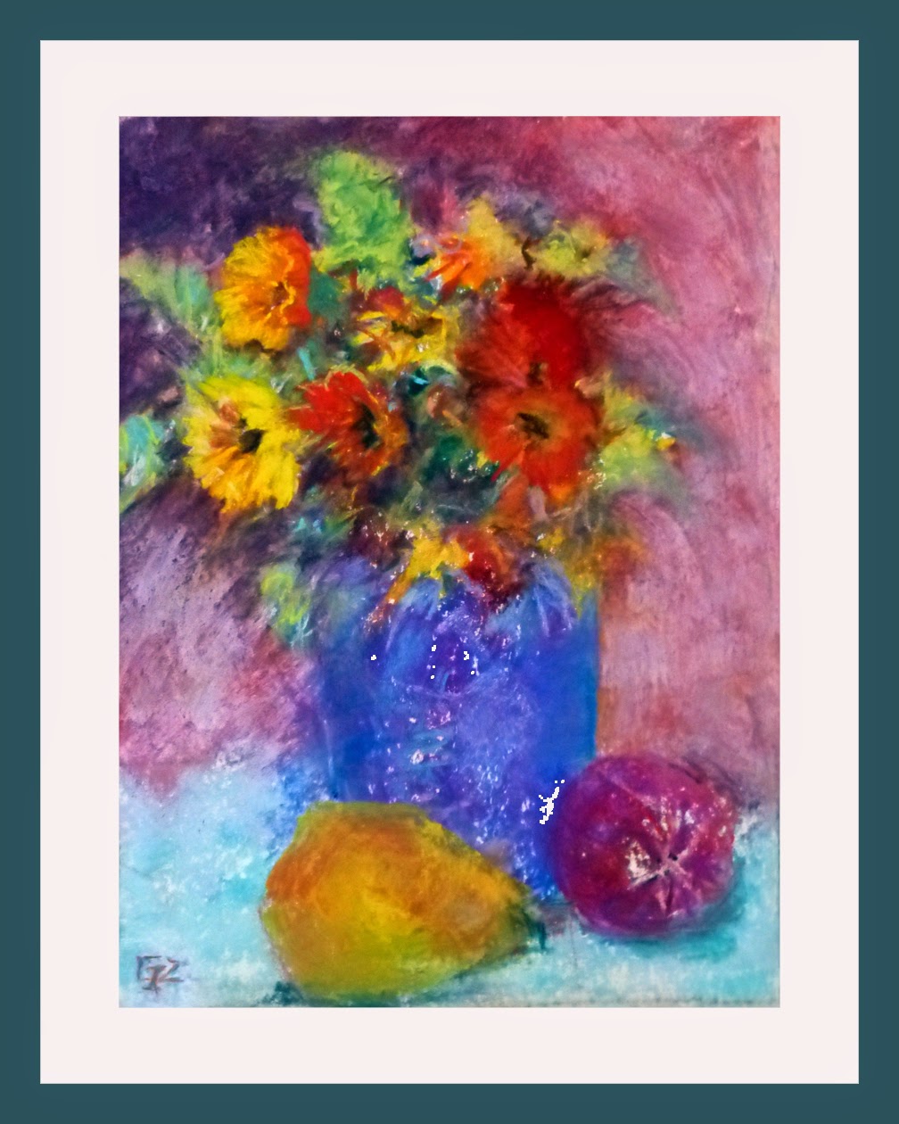

Impressionistic Version # 1

The second one came more easily because I "dreamed/thought"about it during the night, so I knew what I wanted to do when I got to the studio. It is a one-direction diagonal style pastel with lots of black interlaced.  I really like it.


Diagonal Version # 2

Both paintings may be enlarged to see more detail by clicking on the image.  After the holidays are over I may try some other styles modeled after the "Masters".          Any suggestions?  

Please contact me for purchase information.

I am linking this to Paint Party Friday, Facebook, Twitter, and Pinterest.


Have a good week and thanks for taking a look.

Gloria

Monday, July 29, 2013

Gloria j Zucaro's "Summer Sloth"

That is such a funny word!  I know it is one of the deadly sins in the Bible.  It is also the animal that moves so slowly you can hardly notice(except your eyes are glued onto his terribly threatening 4 inch toenails!).  But sometimes I feel like a sloth because I think I should do a particular task, and then I think, "Oh, I will do that later, I would rather..."  So I actually didn't even realize that 4 days had gone by since I last posted!  I have had decisions on moving, conversations about finances, open house visits to possible houses, doctors appointments, scheduling for carpet cleaning, electrical fixes and more pleasurably, visits with friends and family this last week.  But now I am here and ready to show you some of the fun and challenging projects we did at The Clearing.  

Our second painting that we started on Monday afternoon was an "Egg Painting using color references from Zhaoming Wu."  I am quoting Frankie's title on our synopsis of projects.  Frankie had made many reference photos of eggs nestled into fabric.  Some were on pedestals, some just surrounded on the fabric.    We were to use these only as a starting point, but to learn from this how to design/compose a painting by placing your egg in an area and leading the viewer to it.  We were also supposed to show how the colors surrounding the egg reflect onto it.  Use soft and hard edges and most important, too, use a color combination that we didn't ordinarily use or even disliked!  Here is my pastel painting of my egg.
8" Square Wallis Paper with Terry Ludwig Pastels.

I surprised myself with being more abstract than usual.  If you notice, no turquoise!

Tuesday morning was the beginning of a really fun project!  Frankie titled it "Paint an Ice Cream Sundae".  Frankie and her husband Jay decided to stop at Steak & Shake to do research(Yeah, I bet! lol)  Anyway after taking pictures at Steak & Shake for two days in a row of different ice cream concoctions that they paid for and ate, Frankie decided it was going to be too expensive and fattening to make 30 reference pictures.  So she went on-line and got copyright-free photos.Banana Split Royalty Free Stock Photo          This was my choice to paint because, of course, I was attracted, not to the banana split, but to the background colors.  Well originally I tried to put in all the squares of color, but alas, it looked horrible!  So a very abstract background using those colors is shown below with my actual painting.  

8" x 10" Wallis Paper with Terry Ludwig Pastels.

It was so much fun that afternoon to see all the different ice cream treats created by 15 artists!

More tomorrow or the next slothless day!

Monday, April 23, 2012

Gloria J Zucaro's "Pick Me Up At Eight"


5"H x 7"W on Stretched canvas Original Oil painting

See framing options tab above.

This week's Daily Paintworks Challenge is to crop a larger reference photo using any part of the photo that you wish.  To me there were a couple of areas that caught my eye.  this vintage automobile and the circular porch roof.  Here is the reference photo.  Which areas would you have chosen to paint?


Thursday, April 5, 2012

Gloria J Zucaro's "Santa Monica Beach "

12"H x 12"W Oil on Board
Click on the painting to enlarge
Questions?
This is my painting from Dreama's reference of Santa Monica beach.  Reference photo below.  I added the palms on the left and eliminated the path with the people.  I like the sort of Gauguin look.  The glow on the sunny side of the umbrella is from putting transparent Indian Yellow beneath the white during the block-in process.

Colors vary due to differences in lighting and monitors.